(01)
.jpg)
Studios
Digital Content Production Arm (Coming Soon)
(02)
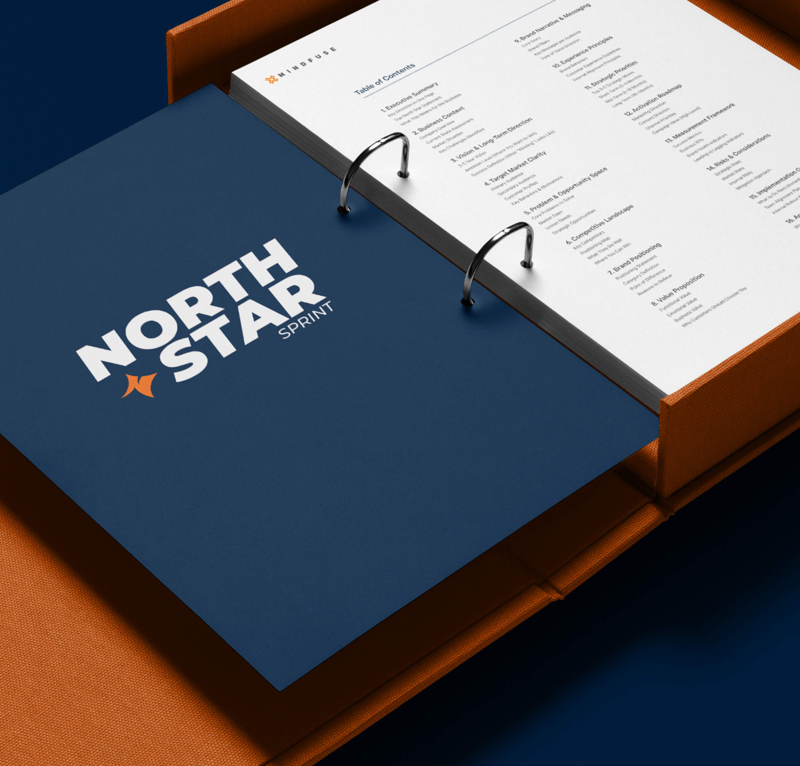
North Star Sprint
Strategic Alignment Workshop
(03)
Cortex
AI Powered Intelligence Software
(Exclusive to Clients)
(Exclusive to Clients)
Close
.jpg)
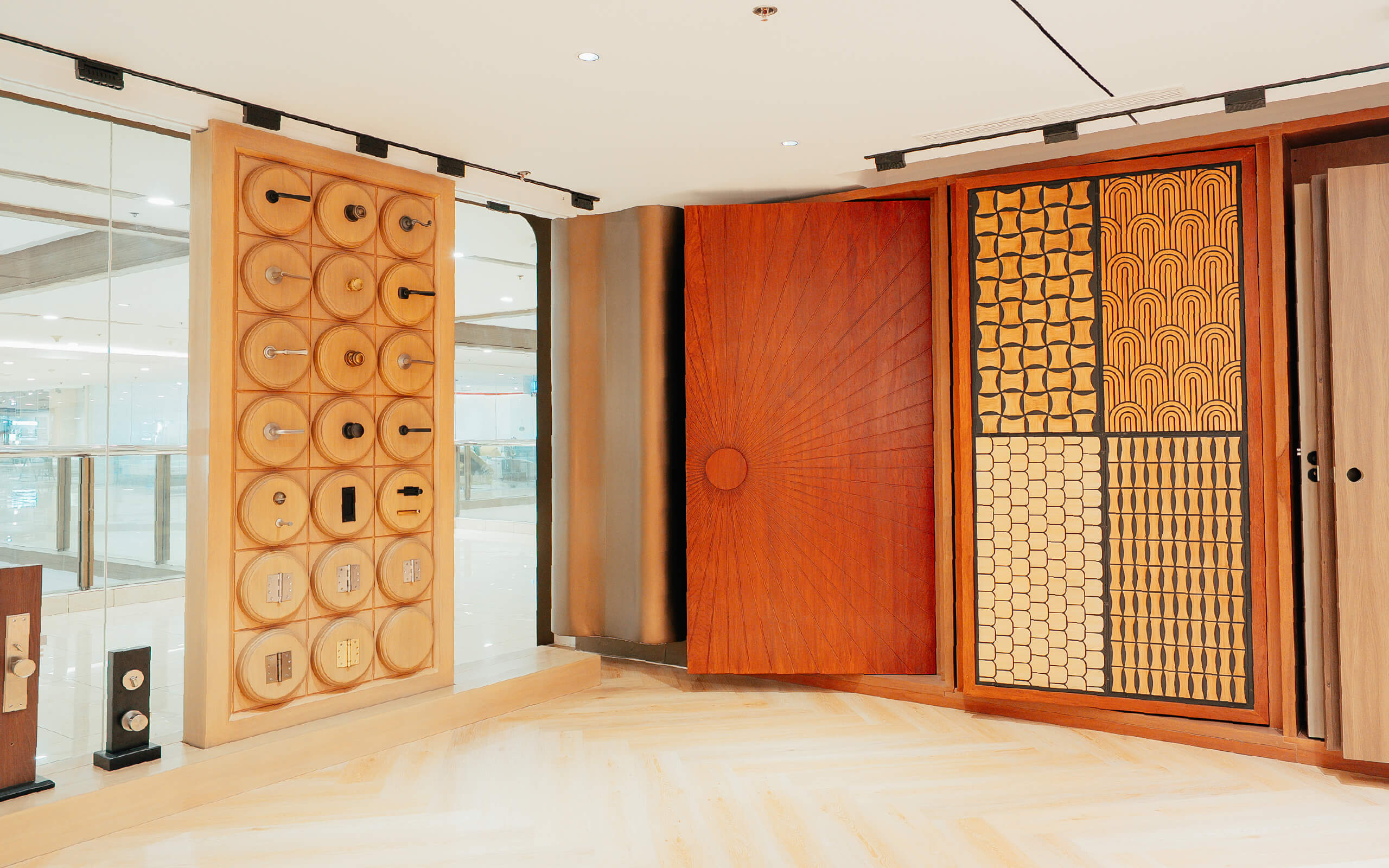
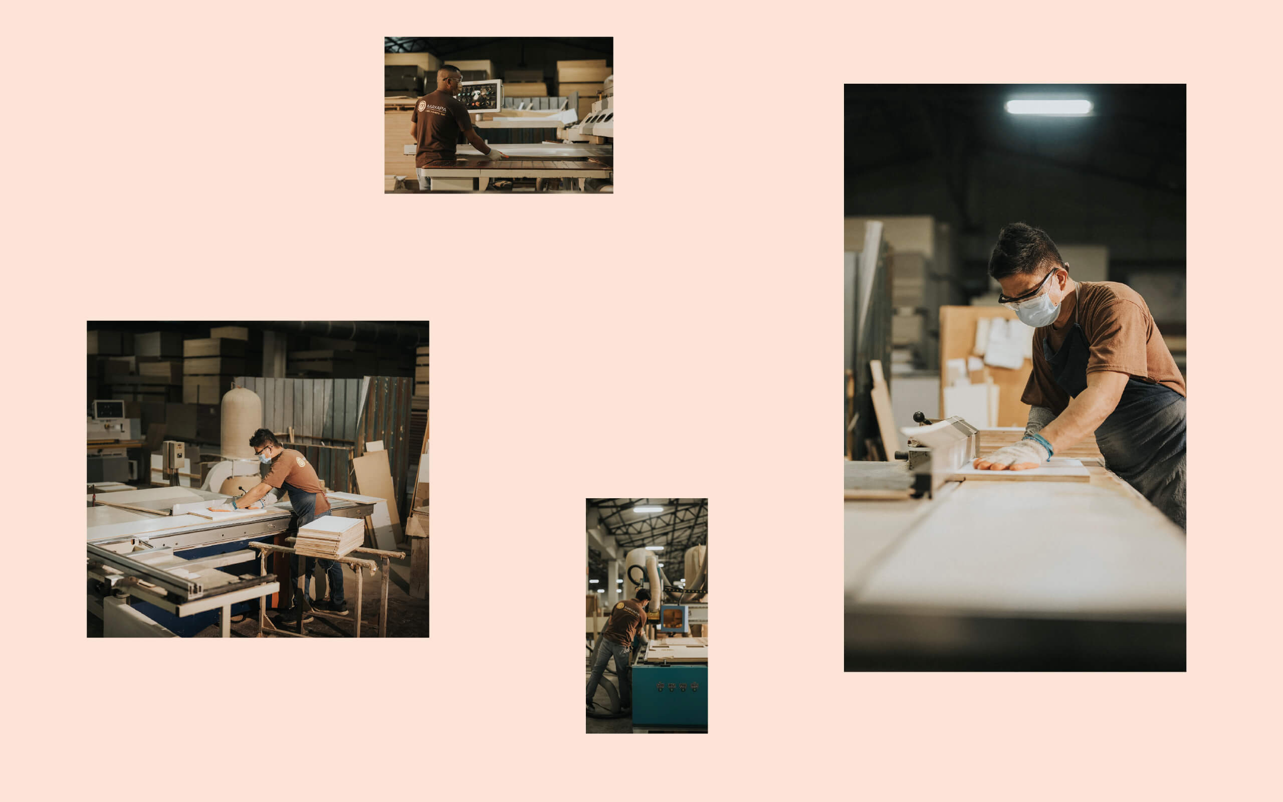
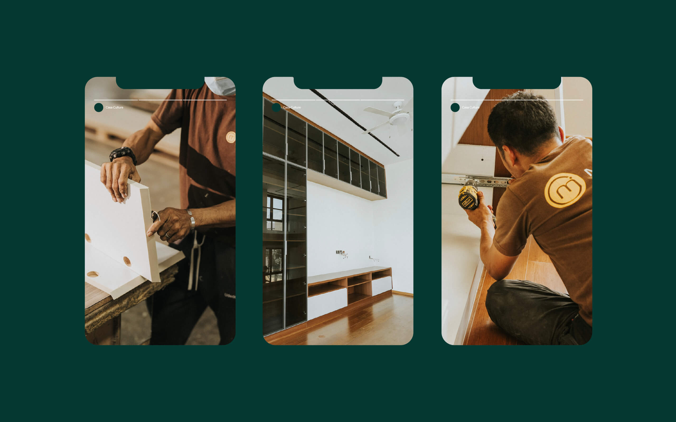
Casa Culture is a premium architectural hardware company based in the Philippines. They carry globally recognized brands like Baldwin, Yale, Dorma, and Delta, and have supplied products to properties developed by Shangri-La, Rockwell Land, Megaworld, and Ayala. Their product range covers everything from custom doors and high-end door hardware to kitchen and bath fixtures, ceiling fans, and security systems.
The company has deep roots in the Philippine hardware industry. Originally known as Coby's Design Center, it was established in 1996 inside Shangri-La Plaza as the premium retail arm of Co Ban Kiat Hardware, one of the country's oldest and most established hardware companies, with a history stretching back to the 1920s. The products and the expertise were never in question. The brand, however, had not kept up.
Coby's had built a strong reputation among architects, developers, and homeowners who already knew where to find them. But the brand itself did not communicate the level of quality it actually delivered. The name, the visual identity, and the in-store experience all belonged to an earlier era of the business.
This created a specific problem: the company was competing in the premium space without looking or communicating like a premium brand. Clients trusted the products, but the brand was not doing any of the heavy lifting that a strong identity should do, attracting new customers, commanding confidence at first glance, and making the quality visible before anyone touched a product.
A rebrand was not about changing what the company did. It was about making the outside match the inside.
The rebrand had to accomplish two things at once. First, it needed to retire the Coby's name and introduce Casa Culture as a brand that felt intentional, premium, and distinct. Second, it could not erase the decades of trust the company had earned. The new brand had to feel like an evolution, not a departure.
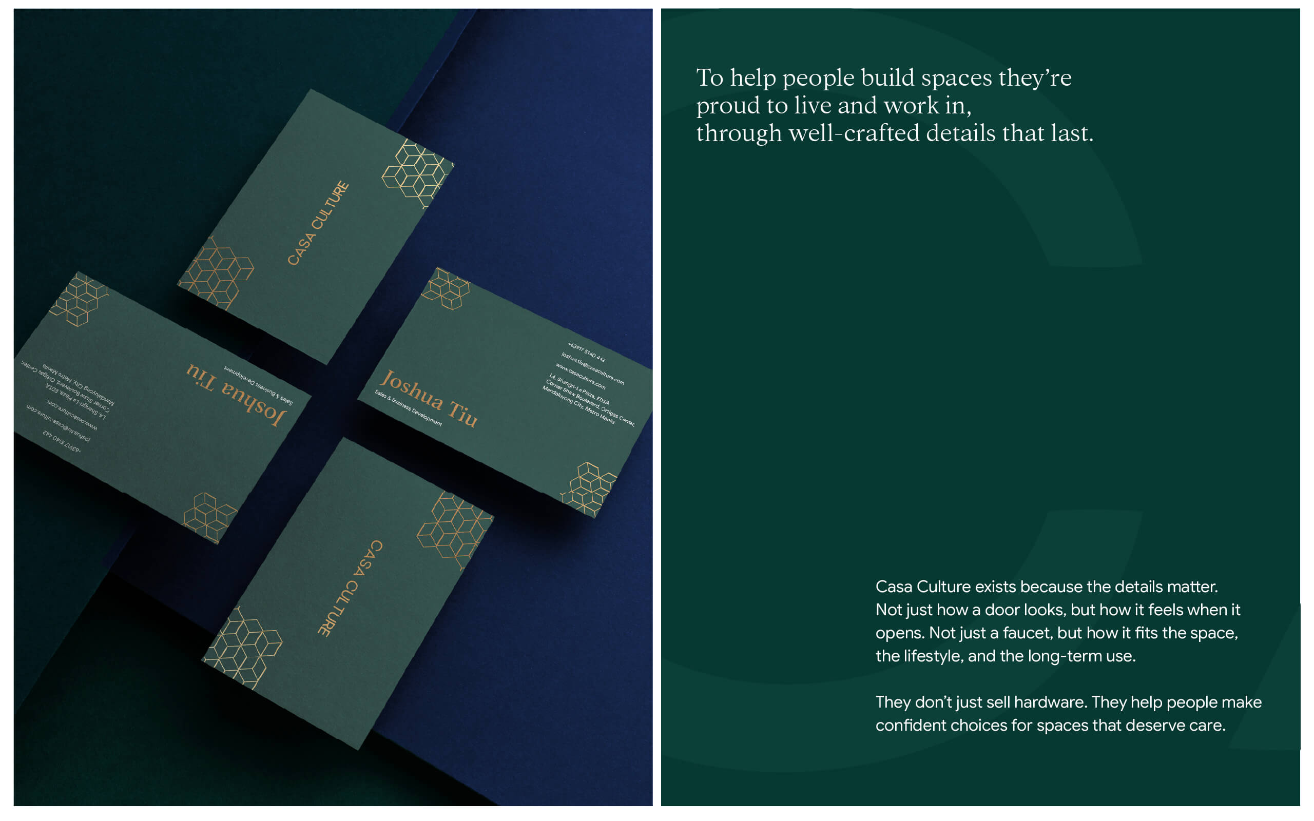
We set a clear principle: Casa Culture should feel like a place, not just a store. The name itself suggested it, a house of culture, a destination where design, craftsmanship, and quality come together. Every element of the brand needed to carry that idea.
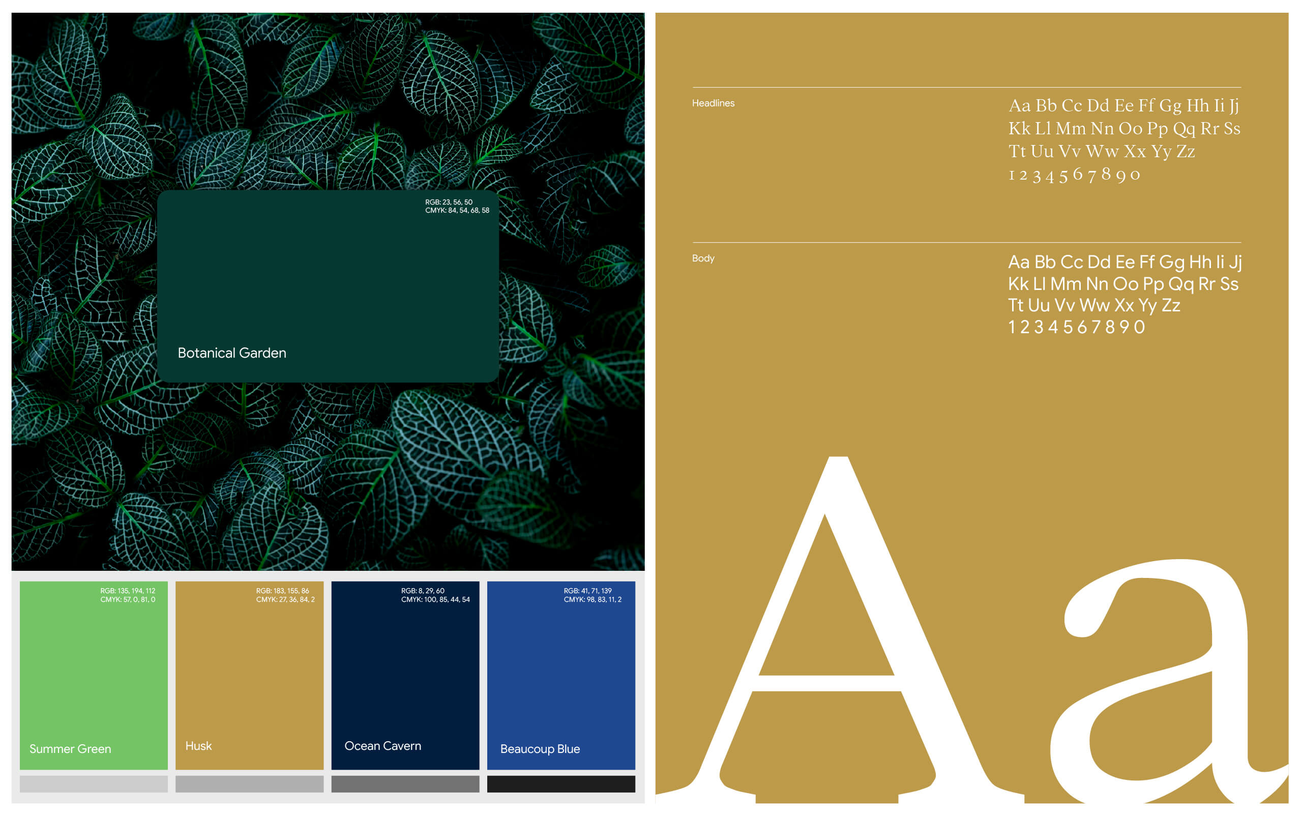
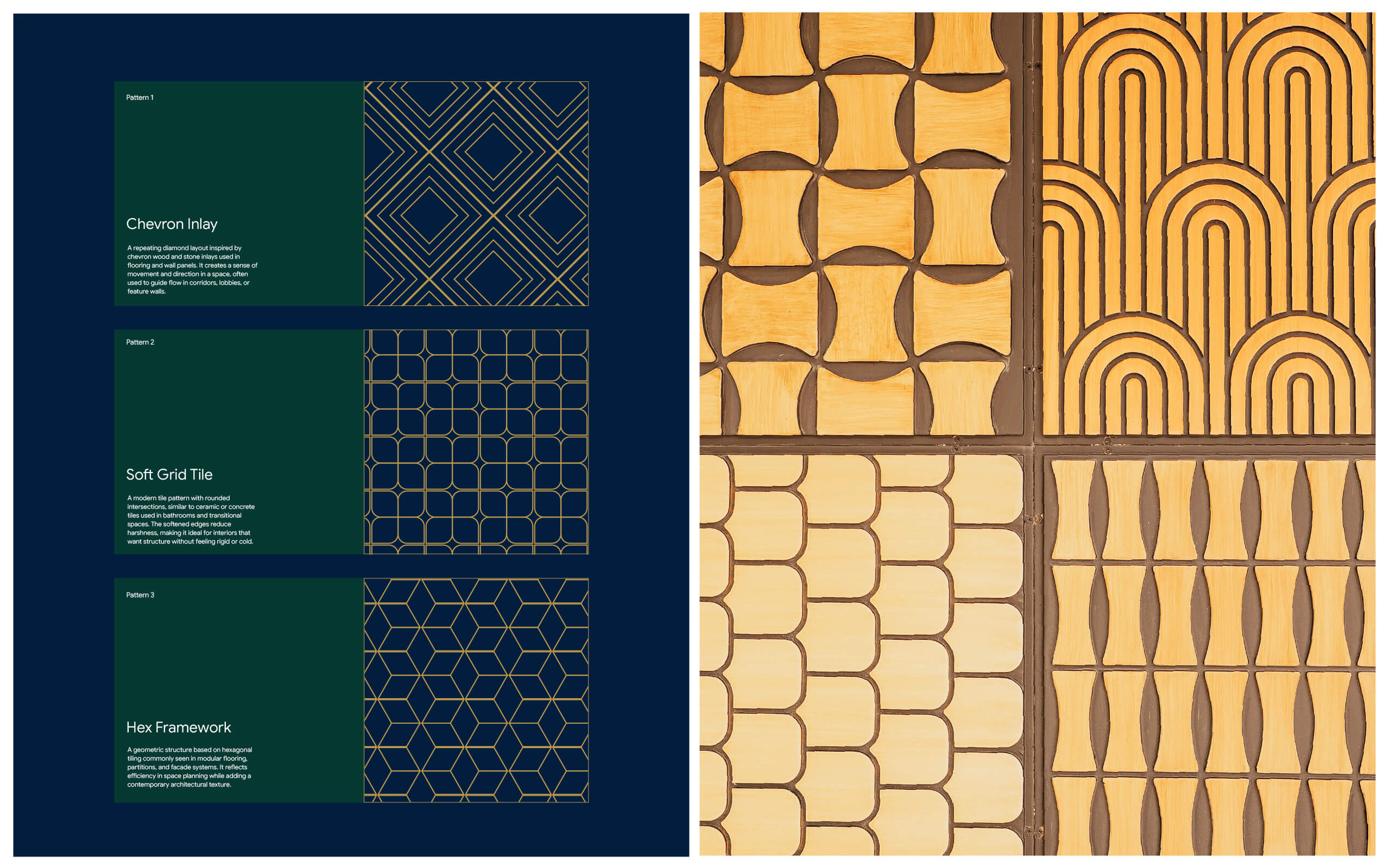
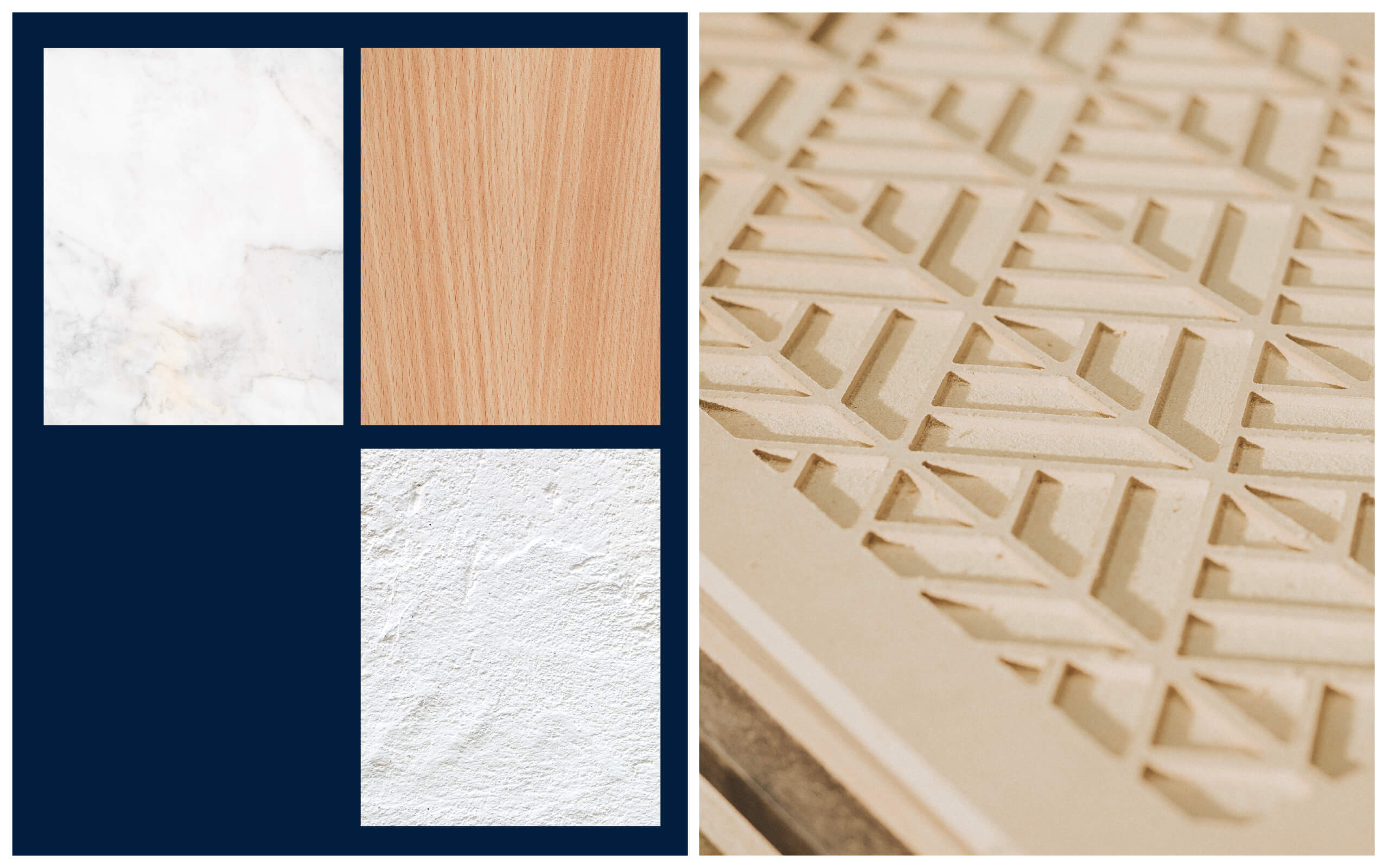
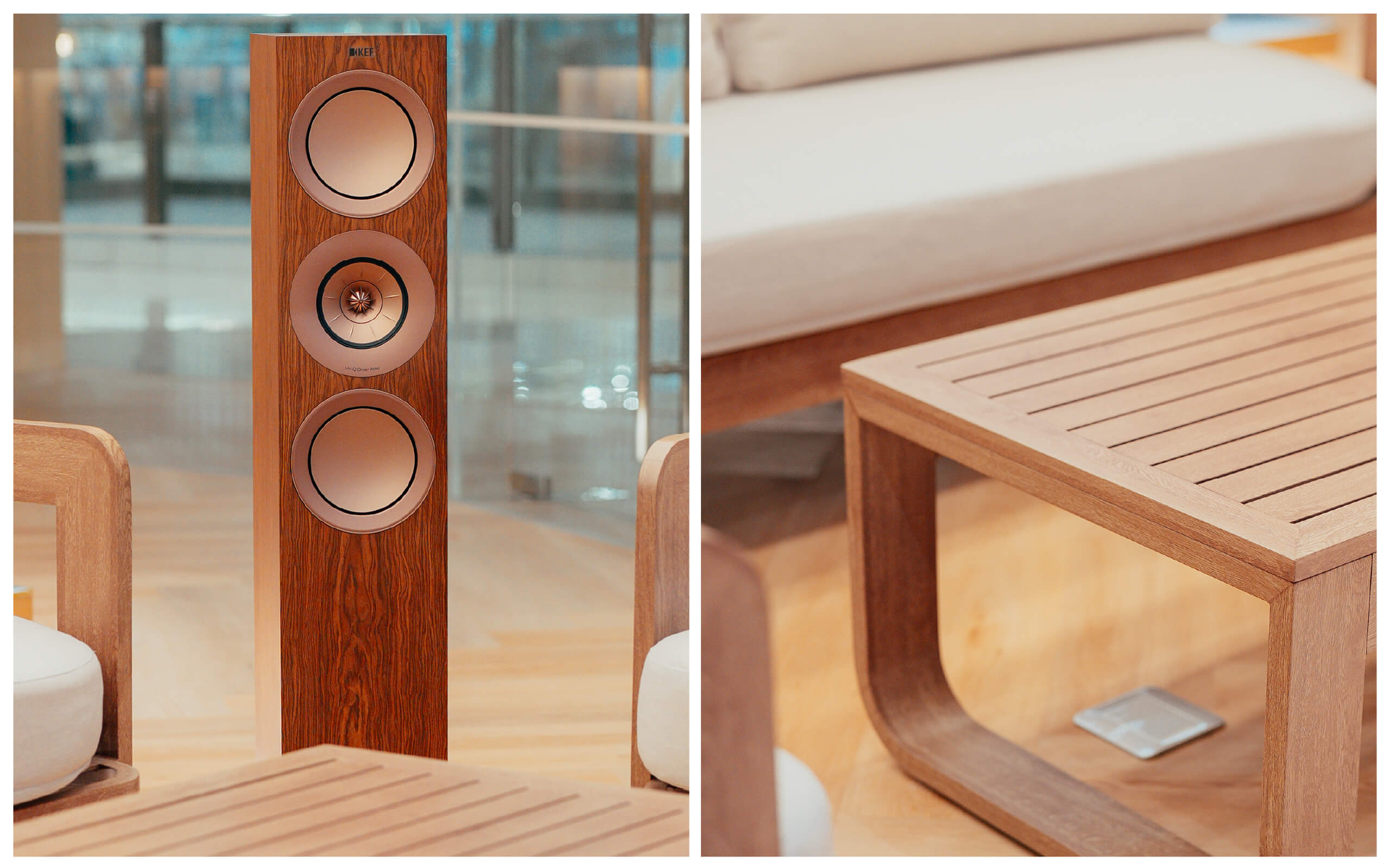
We built the brand identity around the idea of architectural craft. The visual system draws from the same materials and textures the company sells, warm wood tones, deep greens, and gold accents that reflect the premium finishes customers find in the showroom. Geometric patterns were developed to echo architectural details like ironwork and joinery, giving the brand a visual language rooted in its own product world.
The identity extended across every touchpoint. Business cards, brochures, packaging, and marketing collaterals were all designed to feel consistent and considered. The store interior and facade were treated as brand experiences in themselves , spaces where the identity was not just displayed but felt.
Brand communication was written to position Casa Culture as an authority in architectural hardware, not just a retailer. The messaging spoke to architects, developers, and discerning homeowners in language that matched the quality of what was on the shelves.


Casa Culture launched not as a renamed version of Coby's, but as a brand that finally represented the business accurately. The identity gave the company a visual presence that matched the caliber of products it carried and the caliber of clients it served.
The premium positioning became visible at every level, from the store experience to the printed materials to the digital presence. Architects and developers could now point their clients to a brand that looked as considered as the products it offered. New customers walking into Shangri-La Plaza encountered a showroom that communicated quality before a single product was picked up.
The rebrand gave Casa Culture something it had not had before: a first impression that matched its reputation.
How do you rebrand a legacy business without losing what made it trusted?
The challenge with legacy rebrands is that you're not just changing how something looks you're deciding what to carry forward and what to leave behind. Coby's Design Center had operated inside Shangri-La Plaza since 1996, built on the heritage of Co Ban Kiat Hardware, one of the oldest hardware companies in the Philippines. The products were premium. The client relationships were strong. But the brand itself belonged to an earlier era. Mindfuse set a clear principle for the rebrand: Casa Culture had to feel like an evolution, not a departure. Every element of the new identity the name, the visual system, the store experience, the communication was designed to carry the decades of trust forward while making it visible to clients encountering the brand for the first time.
What does a full brand identity system include for a retail showroom?
For a premium retail brand like Casa Culture, the identity system extends well beyond the logo. Mindfuse developed a visual language drawn from the materials and finishes the company sells warm wood tones, deep greens, gold accents, geometric patterns echoing architectural details like ironwork and joinery. That language was then applied across every touchpoint: business cards, brochures, packaging, marketing collaterals, and the store interior and facade treated not as branded surfaces but as brand experiences in themselves. The messaging was written to position Casa Culture as an authority in architectural hardware, speaking to architects, developers, and discerning homeowners in language that matched the quality on the shelves. The standard throughout was simple: the outside should match the inside.